
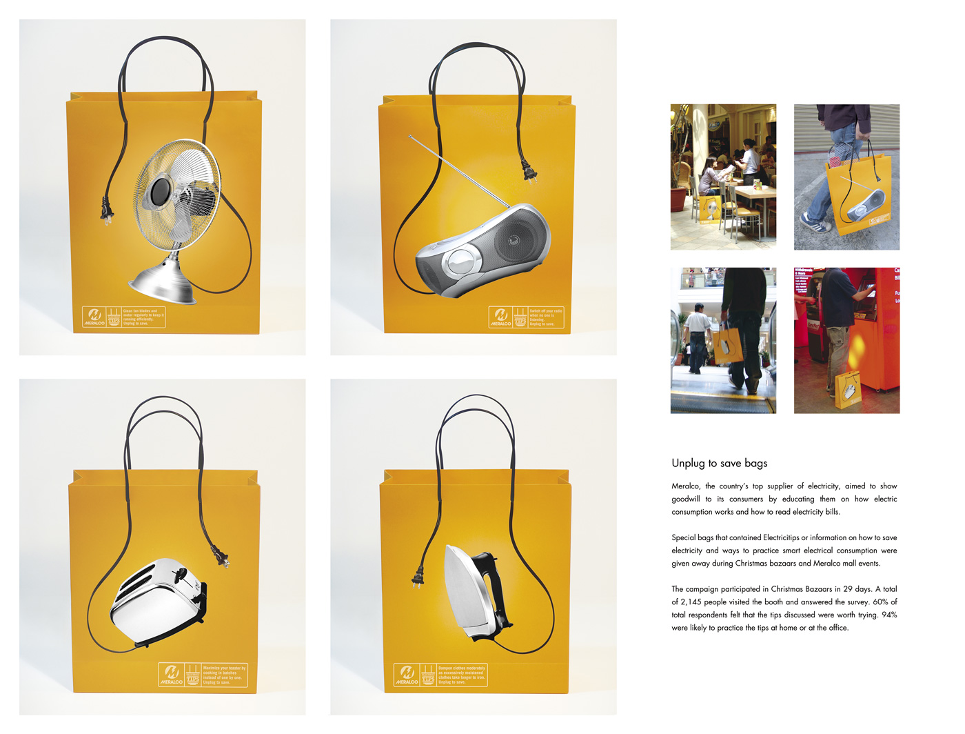
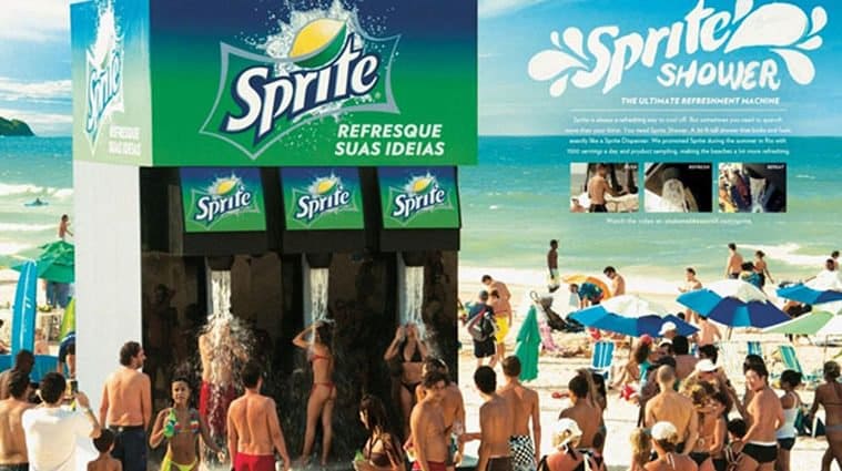
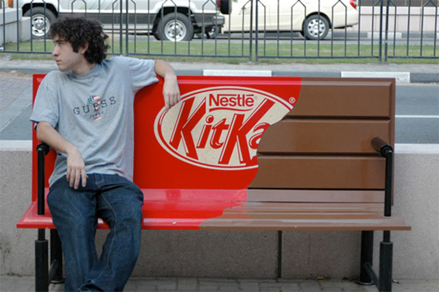
The most brilliant static advertising pieces that use the media as part of the message itself. Inspiring and imaginative!







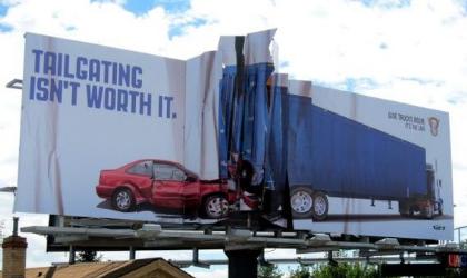



Bad idea from PETA. Just wrong from all angles. A billboard that reminds us that caring about and being sensitive to animals does include humans too.


“I am 100% into data. Just bring me those consumers that are ready to buy. I do not want to talk to anybody else”
I heard this sentence above from a leader of the advertising industry during a national conference two years ago. It shocked me. I knew the perspective of this sentence was as narrow and down-spiraled as growing popular, but I wanted to better understand the process that drives to it. Ultimately, as you will se below, it made me appreciate even more the importance of a key business skill that seems as scarce as valuable: Vision.
The sentence above from our advertising industry leader, is forgetting two key factors and -at the same time- precipitating a very negative and dark consequence:
Factor 1. The art of Marketing includes a key skill: creating desire for a product in somebody that did not have an intention to buy. It is not just about selling cars to those who are ready to buy them. It is about creating the need to buy a car in those who did not intend to buy one, just a week ago.
Factor 2. Leaders in any industry look at the customer funnel beyond their business. They understand that there is also an industry customer funnel, and they know they have to bring new customers into it. “Leeching” from the bottom of the funnel while leaving the effort to feed the top of the funnel to others, only generates a devastating consequence…
The consequence: Some businesses favor and focus on this approach. They only want to talk to the consumer who is ready to buy. They advertise and advertise to this small part of the funnel. They are absolutely proud on their innovative, cool, and “above the competition” strategic focus.
Then they start noticing it is highly competitive down there, in that part of the funnel. The customer that gets there already have other brands on mind. Imposing theirs in the last minute before purchase is not that easy… or cost-efficient!
Then the funnel starts drying out, because they are not building “intention to buy” and feeding the top of the funnel with new customers. They go into “draining mode”. They are reaching out to a smaller and smaller universe, and even when they get a good share of these customers, their number is only decreasing and decreasing. Their business decays. They wondered what happened. They look at gigantic screens with a stream of real time data and cannot find the answer. Their strategy was so smarter than that of the rest of their competitors.
I like to call it “the drainage mentality”. A strategy that only focuses on excelling in a secluded area that keeps decaying over time, while ignoring and neglecting the preceding stage or stages.
It is scary how tempting this mentality is. Numbers and data can be seductive. Specially those that flow in real time. I have seen the faces of many looking at those. It is a god-like sensation. They are convinced they can actually control that data and with the touch of a button increase it at will! The awakening is brutal when they realize they are gods and kings… of a matchbox.
Mr. Wanamaker once said “Half the money I spend on advertising is wasted. I just do not know which half is it.” Some of us are, now and then, tempted to think that sophisticated data analysis can reveal to us exactly which half that is. In that process, we think that we have a great , innovative strategy in our hands. And we lose perspective of a key need in business: the Vision to think beyond our current boundaries, to keep growing, to search for perpetual motion and business growth.
Lack of vision is not a monopoly of certain people… it can happen to anybody, even very smart CEOs (remember “I think there is a world market for, maybe, 5 computers”?)
This 100% data driven consumer-search mentality is the equivalent to developing a very sophisticated analysis software to find out where stones and pebbles are gathering together naturally so we can cross a river without effort, while our competitors have built bridges 100 yards up a month ago, and they are crossing it whenever they want… with trucks.
I, finally, got a small revelation. Thank God, because the train in my commute to home was actually getting to my station. The key is never to fall in love so much with a beautiful tactic that it starts looking like a strategy, and never to confuse a cool, shiny, and seductive strategy with Vision.
Javier


